 |
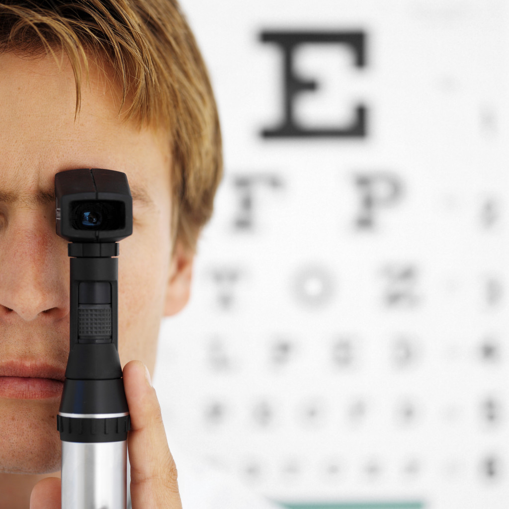
| Black, Les. "Boy Testing Eye Site" 4/20/2013 via flickr. Attribution-ShareAlike 2.0 Generic License. |
I could definitely include an image that connotes the type of pathos that people think of when they think of Earthly problems. This way I could remind my readers why I'm writing about the disconnect between that and funding for space exploration.
2. Does the graph or chart clearly support a major point of my argument?
If I include a graph, it will probably be one showing the comparisons of national expenditures, which would support the point that NASA doesn't actually spend much, and that there are other programs that could be seen as more frivolous.
3. Is the image in close proximity to the argument that it is emphasizing?
I'll definitely put the images close to the points they illustrate. It only makes sense that they would go there, so the continuity isn't lost between ideas.
4. Do your eyes move easily from one section to another in the order you intended?
I don't think this will be too much of an issue, as it will mostly be a single-column body of text. However, I should make efforts to have the final design clear and flowing.
5. If your project contains large blocks of text, could they be broken up more effectively using text boxes, lines, headings, or images?
This is another thing I shouldn't have to worry about, the op-ed being a fairly short genre. However, I definitely don't want to go overboard, like I felt example 2 from my earlier post did. I just felt that there were too many images, and it looked a bit crowded. This is something I'll make sure to avoid.
6. Are your images placed or sequenced in the most convincing way?
I hadn't thought about the sequence of introducing the images, but I'll keep it in mind. I think introducing the pathos first, before showing it's disconnected, will be a good order. A second pass afterward, though, might be helpful.
No comments:
Post a Comment